Violins Owned Between 1744-1802

Having played the violin since the fifth grade, music is something very important to me. The violins had deep roots in colonial American music. Based on the “Probing the Past” data I decided to search for the number of violins that were owned by each location that appeared when I typed in “violins” into the search bar.  21 results appeared as follows that ranged from the year 1744 to the year 1802.

  • 8 in Charles, MD
  • 3 in Richmond, VA
  • 1 in Lancaster, VA
  • 6 in Prince Georges, MD
  • 2 in Lancaster, VA
  • 1 in Fairfax, VA

According to this data, based on the years the database covered, Maryland appears to have been a much better location for those instrumental players. In particular, Charles, MD had the highest number of violins owned within one location. Upon further research, one could distinguish between locations and instruments owned. Perhaps, one location may be more woodwind friendly. Or, other instruments that were not searched would appear. The violin, even though it’s my favorite instrument, may not have been that popular during this time frame.

As such, the data below is a graph to outline the data entered into a Microsoft Excel spreadsheet and put into a bar graph. 

Feltron Reports

Nicholas Felton began recording data from his everyday life. From his interactions online, between individuals, how much of a particular food he ate and the list goes on. What is remarkable about Felton’s reports, or the Feltron reports, is just how much data is visible in each of these data books.

In his 2009 Annual Report, Felton asked individuals to asses his interactions with them. When studying the data, it was increasingly difficult to navigate and understand. At times the font was small and I didn’t even know what each factor he was analyzing meant. There was no legend, nor was there a key to let individuals know exactly what they were looking at.

However, looking over these Feltron reports. Some questions began to crop up. With each encounter that Felton had with someone he asked them to evaluate their interaction with him. Couldn’t this have skewed his data? When people feel as though they are being observed they act differently. Similar to how someone acts differently when they know they are being videotaped, people don’t act themselves when they are being monitored.

Second, how valuable is all of the Feltron data? Yes each interaction he has with an individual is important, but often times individuals put meaning behind statistics that are just that: statistics and nothing else. It is inherent for individuals to try and find meaning behind everything. Simply by cataloging his data, are observers simply giving meaning behind the numbers that isn’t there? Are the data collected in the Feltron reports actually meaningful? I’m not sure I have an answer to that. Perhaps in the future we can find some meaning for this. As of now, I think trying to find meaning behind every action in a numeric fashion isn’t worthwhile.

Third, each individual that had an interaction with Felton recorded their encounter. When people are self-reporting they are more likely to hold back information to make themselves appear in the best light. Perhaps all of the data collected wasn’t accurate. Knowing that Felton was going to be viewing this data, individuals may have held back information in order to not hurt his feelings or make themselves appear as more sophisticated individuals. This most likely had some influence on the data collected.

Overall, I think the notion of collected data for every point in your life is very interesting to observe. Often times individuals go about their day not realizing how many cups of coffee they actually drink or how much food they consume. Recording data in this manner can really highlight important factors in someone’s everyday life. However, in other cases there are many factors that could have skewed the data. Either way, I think an analysis of the Feltron data was an interesting exercise.

Ontop of Maps

This week’s exercise included getting a historical map and overlaying it on top of Google Earth. As I am prone to do, I ended up making my life a lot more complicated than it should be.

Having grown up in Charlottesville, Va before I moved to Manassas, Va I wanted to overlay a historical map of Charlottesville Historic Downtown Mall. I went in search of historical maps dating back to the 1900s and later. I came up short. I was lead to the University of Virginia’s website which then proved unhelpful as they did not provide me with the .JPEG images of the maps that were large enough for me to zoom in and out of.

I went to the the United States Geological Society to see if I could find some historical maps there. While there were plenty of KML files, the website proved unsuccessful in allowing me to overlay the image ontop of a current map by myself.

I went to the Charlottesville Historical Society’s website. Which ALSO proved unhelpful. What I later learned was that the Sanborn Map Company, which back in the 1900s made maps for just about any city in the United States, had made an insurance map of downtown Charlottesville. Having narrowed it down to a company that had obviously created maps for just what I was looking for, I went and did more searching around. I even went to the University Library Database to see if there was a database of historical websites. I ended up getting more frustrated and lost.

After about a 30 minute search, I came upon a Pinterest of all things. Which had EXACTLY what I was looking for including a link to more maps. 

I copied the .JPEG file and went into Google Earth.

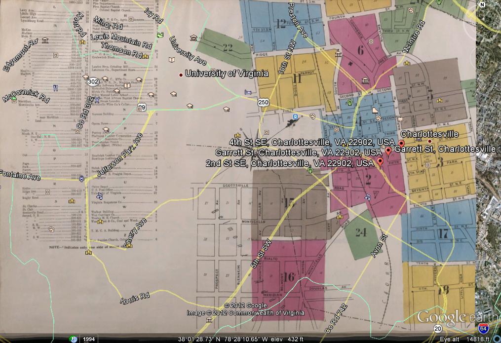
This only proved to be part of my continuous frustration. As I went to overlay the .JPEG of the map of downtown Charlottesville from 1907, I came upon a problem. Not only was the file too big, (in fact too large for me to upload to this blog posting), but I couldn’t resize the image without zooming in and out of the original space. I spent a good hour and a half trying to size and resize my map, only to become even more frustrated in the process. Once I had found fourth street, I didn’t know where exactly I needed to place my map along the street for it to align perfectly with the current street locations and names. Everytime I went to move my map to align with the current view, my map would revert back to where it had stood, making me need to do the whole process over again.

In the end, I admit I gave up. As you see below, I failed miserably in aligning this historical map with the current view. For that I apologize. However, please understand that my frustration was all for a good cause and that I did in fact try.

Exploring cities through technology

PhilaPlace is a historical website created by the Historical Society of Philadelphia. Using a Google Map interface, visitors can explore an interactive map of Philadelphia through photos, sounds, and text. Clicking on one location brings a pop up with an option to listen to the people that make up the city.

Much like any city, Philadelphia has a wealth of history. PhilaPlace is both engaging and informative, allowing for people of and outside of the city to explore its richness. The site not only allows one to see historical places, but also allows for a historical map to be placed underneath the current map of the city.

In our previous in-class discussions of what individuals are gaining or loosing with the internet, individuals aren’t loosing anything from sites like PhilaPlace. Instead, they are gaining new knowledge. Making these stories of individuals at historical places available, makes individuals want to go see them. This only enhances the city, not hurt it. In a similar case, has Foodnetwork’s shows about local eats hurt those places? No. It’s enhanced them.

In fact, I would argue that many cities should take advantage of the tools that are available to them. Fairfax County, where George Mason University is located, should have something similar to PhilaPlace. What PhilaPlace offers is a way for individuals to connect to the maps and the history around them. So often when individuals look at maps they don’t know how to understand them or know where they fit in. PhilaPlace allows for individuals to be connected to the history of the maps that they are viewing.

I want to be a reporter for National Public Radio. Therefore, the sounds of the city and individuals’ stories are what I find compelling. Using both visual and auditory senses to put people into certain places are what I find most appealing about this project. The project also doesn’t just allow for outsiders to view a city, but for individuals of a city to see their own city in a different light. They are also able to share their own stories about their city, allowing for a collaborative process to occur that is only made available because of the internet.

I am interested if other cities have thought of undertaking such an expansive project.

Charts, Maps Oh My!

This week our class went exploring. Our first task was to create a chart.
Below is the chart that I created:
Voter Approval of President Obama

I got the statistics from Gallup Poll on President Obama’s approval among voters. While originally I thought this would be easy, however it was not. I’ve done charts in the past for classes, however this was using Microsoft Excel instead of Google Chart maker. I thought the whole process confusing and not user friendly. I entered the correct information, but the chart wasn’t aligning with what I put in. I am hoping that Google fixes these kinks because I think the average user would find this very confusing.

The next step was to create a basic map.
This was also very complicated. I had a difficult time using the tools as well as drawing the straight line. However, I was able to make a map from Manassas to President’s Park, an often confusing location for many visitors of the campus to get to.


View How to get to President’s Park in a larger map

Overall, I found all of these exercises very confusing to follow through on. There didn’t seem to be a very simple way to teach someone to use these tools adequately.